
Mindy Brooks, VP of Product Management and UX for the Android Platform, joins us on Android Faithful to dig into the story behind Material 3 Expressive. We dive into the four-year journey from Material You to today’s big redesign, including how Google balanced personalization with accessibility and why user feedback shaped key decisions like the upcoming blur toggle. We also explore how Material 3 Expressive touches all kinds of surfaces, plus the small details that might make you smile.
Note: Time codes subject to change depending on dynamic ad insertion by the distributor
00:00 - Podcast begins
04:54 - Introducing Mindy Brooks from Google
05:24 - From Material You to Material 3 Expressive: Why now?
07:48 - Balancing design flexibility with user preferences
10:15 - Addressing accessibility and readability in Material 3
12:54 - The upcoming blur toggle customization
14:05 - What’s new in dynamic color theming
15:31 - Subtle tweaks, haptics, and animations that delight
17:30 - How Google decides where to add polish and detail
19:24 - Availability of Material 3 Expressive on Pixel 10
20:14 - Closing thoughts and thanks to Mindy Brooks
This transcript has been lightly edited for clarity and readability. The substance and intent of the speakers remain the same.
RON:
And we're here with Mindy Brooks, Vice President of Android Consumer Product and Experience at Google. Thanks for joining us, Mindy.
MINDY:
Thanks for having me. Excited to be here.
RON:
It's a super exciting time in the world of Android and the world of Google, with the recent Made by Google event unleashing the Pixel 10 line of phones. But, of course, we've all been anxiously awaiting the release of Material 3 Expressive, and most notably because it's been four years since the last major UI update to Android with Material You.
We're hoping you could tell us a little "behind the scenes" about the journey, inside of Google and Android, from Material You to today with Material 3 Expressive. What factors drove the decision and timing for a major UI update across the operating system at this point?
MINDY:
When we launched Material You in 2021, we felt that our products needed to become more personal, energizing, and less about a cold design system. Leaning into that and building on top of the launch of Material You in 2021, we really started to see an increase in people seeing their devices as an extension of themselves. It's like a reflection of your personality: everything from how you customize with cases to how you customize the wallpaper. With Material 3 Expressive, we built upon the fundamental principle that "your device should feel like yours."
This is how it came to be in terms of how we looked at how our design system was reflective across device experiences. It's also such an exciting update because it's not just about phones and foldables, it's also about all of your devices, including your watch. That was a great evolution of the design system.
We were anchored in a data driven design exploration as we built out Material 3 Expressive over the last four years. We conducted 46 studies with over 18,000 participants to hone in on the look and feel of Material 3 Expressive, and find the balance of what it means to add more expressiveness to a design system while making sure it was palatable for our users and reflected what they wanted. That was the exploration that went into it and how we drove the decision-making behind this major UI update.
RON:
That's great that you mentioned the users because that's one thing that we were curious about. Some of the initial reaction to Material 3 Expressive has been that it feels a little too bubbly, it's a little too cute for their own personal tastes. How do you address that for people who see Material 3 expressive and feel like it's a little too "Gen Z" for their own preference?
MINDY:
Our aim is to make sure that our design system is as flexible to each user as possible. That was really the goal in going into this design system and wanting to make sure that it "flexed" to your personality style. If you wanted a bold pop of color, you can get that bold pop of color. If you like the more softer, more subdued tones, you can get that softer, subdued tone throughout the experience. We are trying to ensure that the Material 3 Expressive toolbox supports both a paired back user experience as well as ones that are bolder. If you like the pop of indigo or you want peony colors, all of those things can be flexed across the system. We are trying to accommodate the spectrum as much as we possibly can within the design system.
We looked at metrics of use over time and tracked as the user adapted to the design system. Does their preference for the design system go up? How does that actually track over time? That is one thing. When we're looking at people that have an initial reaction to it that are like, "I don't know," what we are seeing is that over time, that increases substantially in terms of preference. That's a good sign for us. It's something that we'll continue to monitor to make sure that we are trying to meet the needs of our users across the spectrum no matter where they're at.
MISHAAL:
You mentioned at the beginning that Material 3 Expressive is highly flexible. Android is used by millions and millions and millions of users, including many users who need special care when it comes to designing an interface that is accessible to them. We're seeing a lot of these new UIs like Liquid Glass on iOS 26 and, now, Material 3 Expressive implementing background blur across a lot of UI elements. Some people feel that it looks nice, but they might feel that it hampers readability a bit. When your team was designing Material 3 Expressive, how did you factor in this when it comes to accessibility? Can you walk us through the process that your team goes through to make sure that a new design like Material 3 Expressive is accessible? What special challenges do you face when much of the design is algorithmic and not fixed?
MINDY:
We make sure we have accessibility experts and community members working with us throughout the entire development process. They help shape and test and give feedback as we go along the way to make sure that our design components are accessible. I'll give you a few studies on what we worked with accessibility experts to bring to life. The updated haptics and sounds across the system have more meaning for those who don't rely on visual cues.
The updated haptics and sounds across the system have more meaning for those who don't rely on visual cues.
For example, we leaned into the notification dismiss haptic. I don't know if you've played with that one. That was one that was developed and tuned to make sure we're supporting those that don't rely on those visual cues. Another one was, we maintain all contrast on all personalization, balancing aesthetics with the visual needs of all colors, theme variations, and more. So, really trying to support the necessary needs of contrast that's necessary for those factoring in accessibility needs.
The other one I would call out here, and there's many more, was we have larger font sizes for quick setting buttons that really leverage shape to morph to communicate the on/off state. All of those are ways in which we've really tried to hone the design system over the last few years as we built it to make sure that we are being accessible, by design, for all users.
On the question of blur specifically: our hope with the use of blur was to be able to focus your attention as a user and be able to keep you, visually, where you need to be on the screen. That was really the design principle behind it: how do you minimize distraction by the use of blur? That said, we obviously know that it doesn't meet the needs of all users. We will be rolling out a new customization setting so that you can turn blur off as well in the near future.
That's another way in which we're trying to make sure that, again, with Android, we are enabling the platform to be as customizable as possible to be able to support all of our users, no matter where they're at. That's a lot of the work and thought behind our development here.
MISHAAL:
Our listeners will know that this is Material 3 expressive, an evolution of Material 3, which was first introduced with the 2021 Android 12 release and Material You. Part of that rollout was the introduction of dynamic coloring. In the blog post announcing Material 3 Expressive, there was a mention that you've updated the dynamic color themes. What changes have you all done to the dynamic color system since it was introduced with Material You? Have there been any significant improvements, optimizations, or other changes to the algorithm?
MINDY:
This is the first time we're bringing shared color themes across devices. That's an exciting update from Material Expressive. On your watches, for example, this is the first time color theming is available. In addition to that, we've updated the dynamic color system to allow for more variation and higher chroma across the board, which in turn makes themes more customizable.
The chroma will make colors truly pop, pushing them into brighter spaces, as well as adding more variations across the spectrum to allow for more dynamic options for you as a user. That spectrum becomes much larger and it helps you with your preferences as a user that you can have a more bold color, a more muted color. All of that is part of the dynamic color system that we built for Material 3.
MISHAAL:
You mentioned earlier one thing in particular that is improving accessibility for user: the new notification haptic dismissal. Are there any other tiny subtle tweaks and animations that most people who are upgrading their phone might not even realize are there now? Anything in particular that you would consider a small visual or haptic change other than that?
MINDY:
This is probably my favorite part about the design system. All we really wanted to make sure with Material 3 is that we just sweated the small stuff. I think you can feel that in the design. It's like you have this new subtle animations throughout the entire experience that it is trying to lean in to add a moment of delight for a user, and a heightened focus to attention—detailed attention.
We've refined the home screen screen grid to make sure widgets and icons line up right to make everything feel more polished and more attention to detail there. We've also added more meaningful improvements to animation. When you dismiss one notification, the surrounding notifications will subtly respond to the motion and you'll be met with that soft haptic rumble as you dismiss it. These more springy fluid animations bring small moments of joy to everyday routines. It makes the design feel very thoughtful. We're trying to add it in elements of delight throughout your everyday interactions in a meaningful way. I think that's one that's one of the best things about Material 3 Expressive.
RON:
I would love to pull the curtain a little further back, if you'll indulge us. As you guys are working on this over this time period and developing Material 3 Expressive, how do you guys decide where to make those subtle changes and where do you decide to add that kind of attention to detail? Is it serendipitous where you're working on something and someone goes, "Oh, wait! I think we can do this." Or is it something that comes up in user testing? How does it happen organically, or is it a bolt of inspiration?
MINDY:
When we were thinking about how we layered in the motion, we sat in a room and were like, "Okay. Let's just break down the entire system UI. Where are the moments that we could add in motion?" And we started to do an inventory of what that would be.
For you as a user, if we added motion to every single one of those moments, you would be like, that is way too much. We then started to apply more of a rubric for when it does add support for a user and when it also adds just a little bit of delight. It doesn't get in the way of what the user is trying to do, but it adds a feeling of polish and attention to detail.
That's how we started to hone in on the particular use cases in which we decided to refine and then test with users. We wanted to make sure we had a nice balance. We don't want it to be too distracting. We wanted to make sure that it was something that was adding that nice attention to detail. That was where we refined multiple rounds of research with users and ourselves playing with it. If we got annoyed with it, then a user would probably get annoyed with it.
MISHAAL:
Material 3 Expressive sounds like a delightful update to the design system for Android. If you're looking to pick up the new Pixel 10, is this something you have to enroll in a beta to get or is this something that'll be available to Pixel 10 users out of the box?
MINDY:
We're really excited that you'll be seeing the full design system come to life on Pixel 10. I hope everyone gives it a try. We want your feedback, so please send it our direction.
RON:
We thank you so much for your time. Thanks for coming on Android Faithful and giving us a little insight into the new world of Material 3 Expressive.
MINDY:
Thank you all for having me.
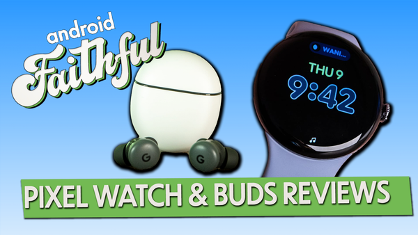
We're talking Google Pixel Watch 4 plus so much AI again and of course we can't stop saying, Nano Banana!
This week we have lots of reactions to the Google Home news plus lots of rumors from Samsung!

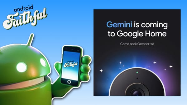
We're back with another exclusive interview with Anish Katukaran, Chief Product Officer of Google Home about the launch of Gemini for Home, replacing Google Assistant, and the challenges they faced.
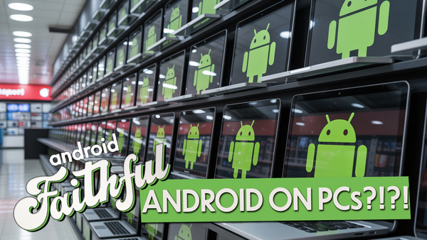
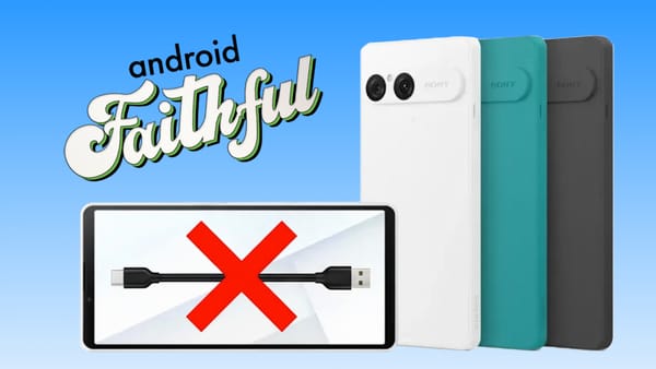
Android coming to PCs as Amazon leaves Android and hands on with the latest flagship phone from Xiaomi and app drama with F-Droid.

Plenty of talk about where Gemini is headed (turns out, everywhere at this point), Jason has a brief review of the TCL Nxtpaper 60 Ultra, and Huyen details the walkie talkie feature of Nothing's new earbuds.
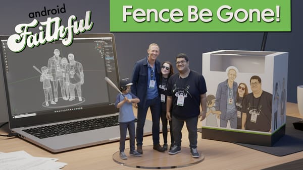
Mishaal, Florence, and Jason finally close the loop on one of the longest running gags from the All About Android days, and it involves fences.

Beeper’s new CEO Kishan Bagaria shares the app’s evolution, the potential of AI integration, and a shift to on-device privacy.
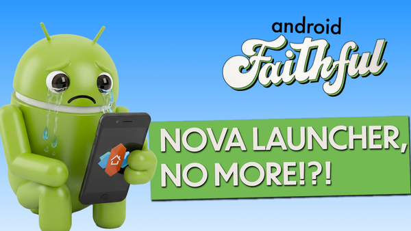
It's a drama filled week in the world of Android from the fall of the beloved Nova Launcher to OnePlus's camera break up along with new hardware from Samsung.
Google avoids disaster in the Antitrust case while the Pixel 10 problems stack up and Samsung leaks how the trifold folds!
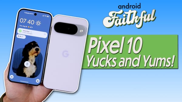
Florence and Jason have been using the new Pixel 10 Pro for almost a full week and in good parental fashion are prepared with their Yucks and Yums of their time with Google's latest and greatest!

Mindy Brooks, VP of Product Management and UX for the Android Platform, joins us on Android Faithful to dig into the story behind Material 3 Expressive.
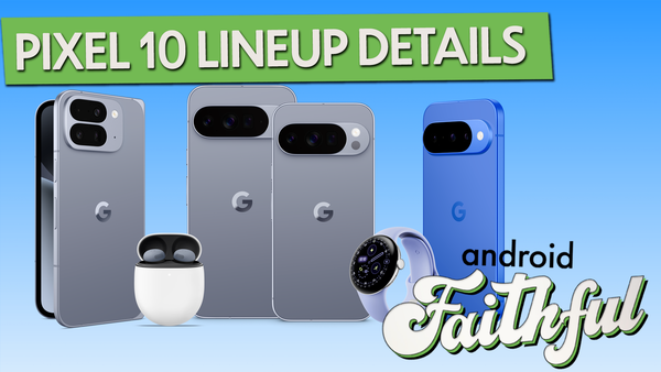
The wait is over and we have all the details on the new Pixel 10 line of phones, the Pixel Watch 4 and all the other devices announced by Google.

Amazon says goodbye to Android and we say hello to Pixel 10 leaks plus ponder the future of Google TV.

The dog days of summer are upon us, but that doesn't stop Android from having legal drama and phone release rumors!
Flo reviews the Z Fold 7, Jason shows off the Tuneshine frame, and everyone goes gaga over MagSafe finally coming to the next Pixel.