The next evolution of Android's design language introduces new animations, expressive styles, and a long-awaited system-level blur toggle.

In this exclusive interview, Mindy Brooks, the Vice President of Product Management and UX for the Android Platform, talked to Mishaal Rahman and Ron Richards about the four-year journey from Material You to Material 3 Expressive.
And there's excellent news for those who have been patiently waiting: Google is adding a toggle to turn off background blur in Material 3 Expressive as a direct response to accessibility concerns that emerged as the new design rolls out.
When we pressed Brooks about the heavy use of background blur throughout Material 3 Expressive— something we're seeing across the industry with iOS 26's Liquid Glass too—she acknowledged that while the design principle was solid, the execution doesn't work for everyone.
"Our hope with the use of blur was to be able to focus your attention as a user and be able to keep you visually where you need to be on the screen," Brooks explained. "But that said, we obviously know that it doesn't meet the needs of all users. So we will be rolling out a new customization setting so that you can turn blur off as well."
The timing suggests this toggle wasn't originally planned and that it was added as a reaction to real-world usage patterns. Either way, it's great to see that the toggle will give users the choice to have blur turned on or off.
The scope of Material 3 Expressive's development is impressive. Brooks revealed that Google conducted 46 studies involving over 18,000 participants to nail down the look and feel. Google tracked user preference changes over time, not just initial reactions.
"When we're looking at people that have an initial reaction to it that are like, 'I don't know,' what we are seeing is that over time that increases substantially in terms of preference," Brooks noted.
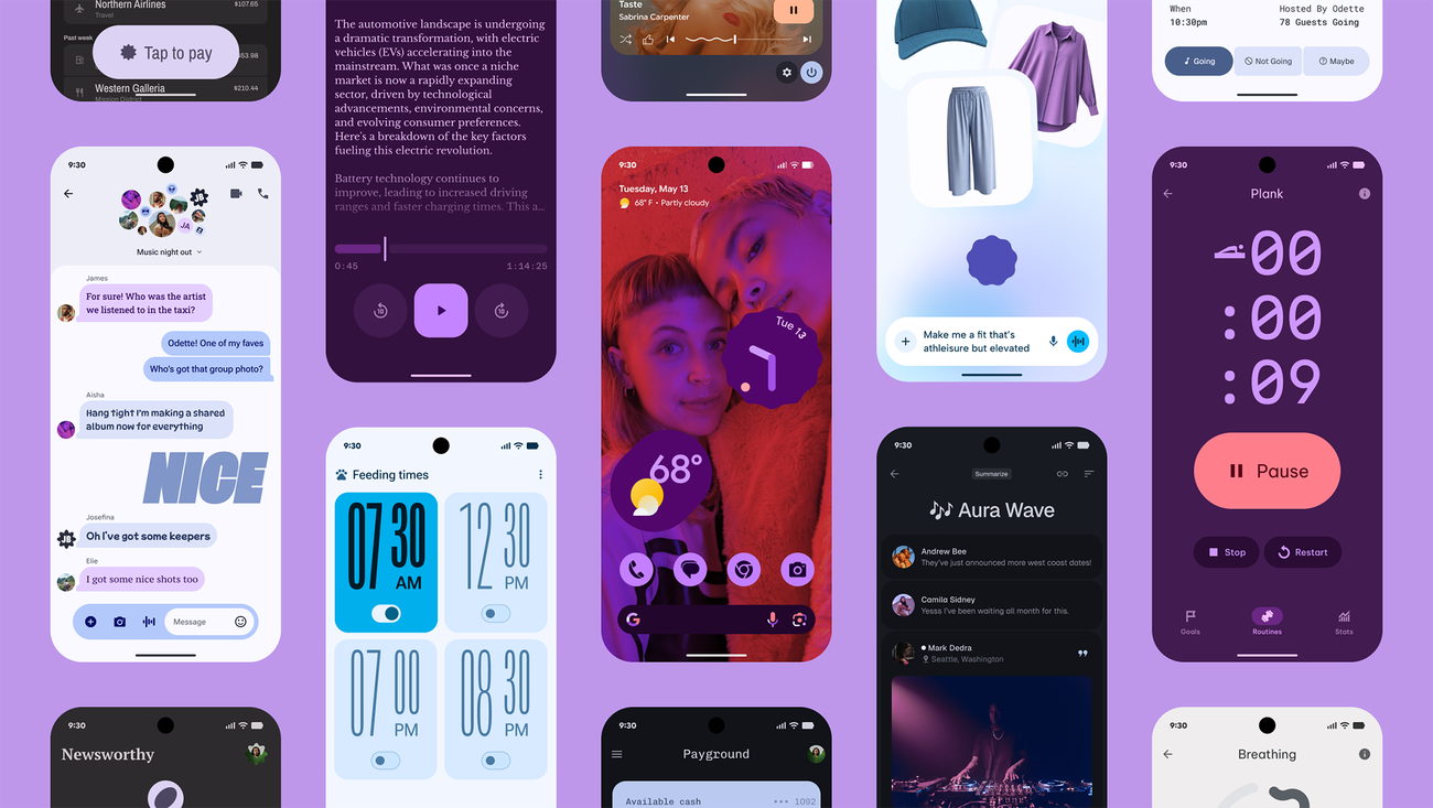
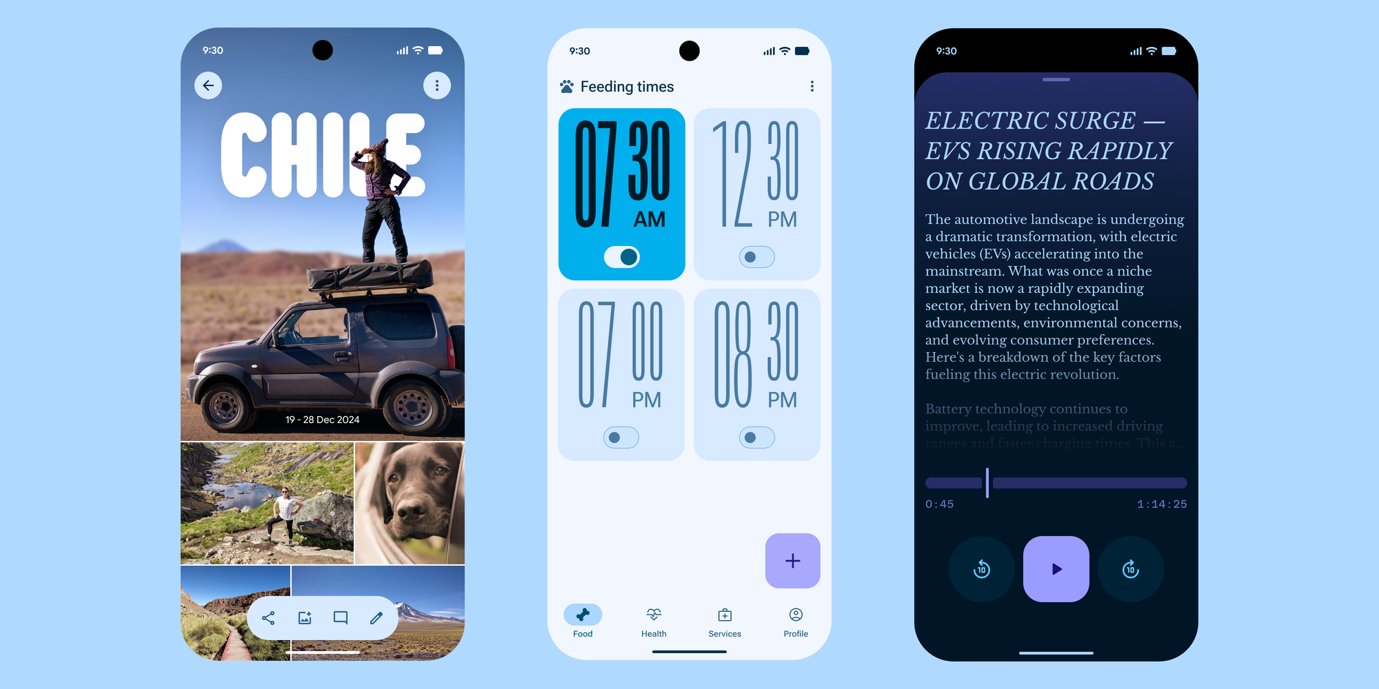
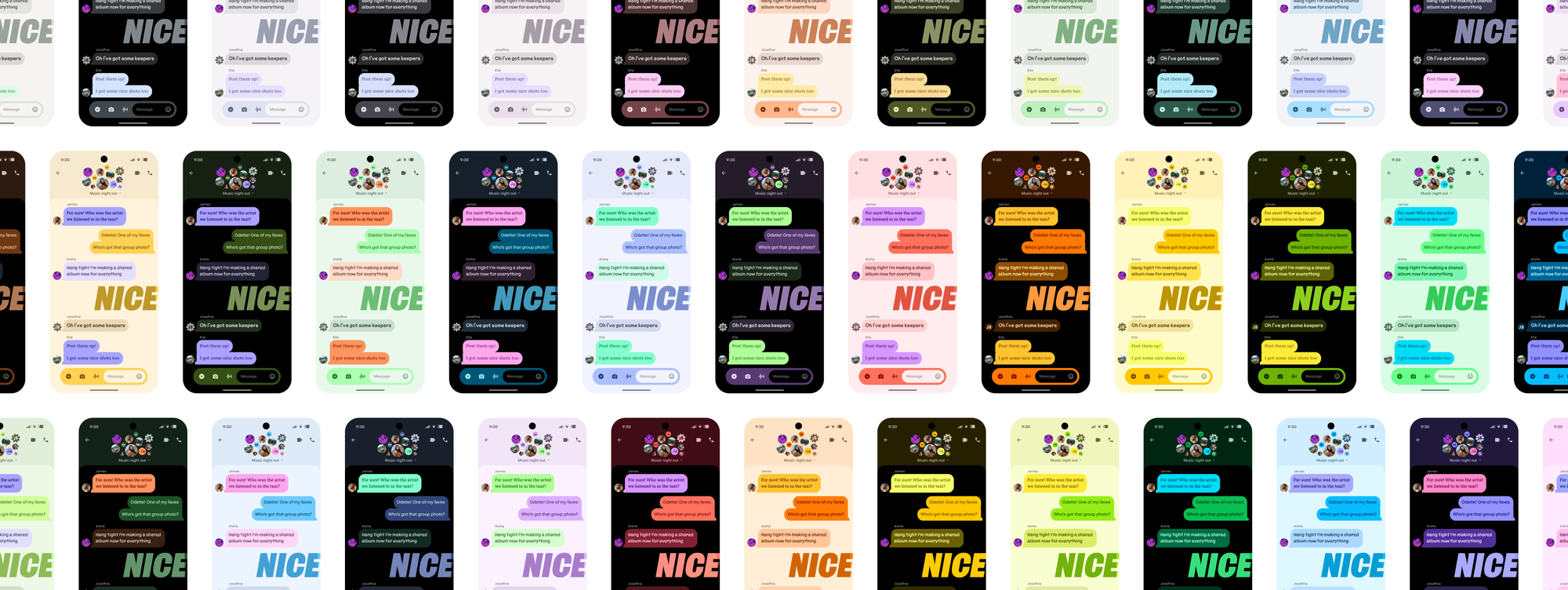
While everyone's focused on the bubbly aesthetic changes, the actual innovation might be less visible. Material 3 Expressive marks the first time Google is bringing shared color themes across all devices, including Wear OS watches, which has been a glaring omission for years.
The dynamic color system got some serious upgrades, too. Brooks mentioned "higher chroma across the board" and "more variation across the spectrum." Colors should pop more while giving users a broader range of customization options. The jury is still out on whether that translates to genuinely better personalization or merely more ways to make your phone look garish.
Video: Google
Google's attention to micro-interactions in the interface hopes to add some dynamism to a characteristically static interface. Brooks walked us through the process of inventorying every possible moment where motion could be added to the interface, and then applied a rubric to determine what adds value versus what a user might find annoying.
The result is subtle touches like notifications responding to each other when you dismiss one, refined home screen grids that make everything align "just right," and those soft haptic rumbles that accompany specific actions. It's the kind of polish that Android has historically struggled with compared to iOS.
"If we got annoyed with it, then a user would probably get annoyed with it," Brooks said about the internal testing process.
Google says it had accessibility experts involved throughout the entire development process, though the company has always waved a high flag for accessible interface design. The examples Brooks cited, including improved haptics for those who don't rely on visual cues, maintaining contrast across all personalization options, and larger font sizes for quick settings, suggest it's still a central tenet of importance while developing Android.
Want to get your hands on the new UI? Material 3 Expressive will come out of the box on all devices part of the Pixel 10 rollout—no beta enrollment required. For everyone else, if you're itching to get your hands on the new Material, you're still stuck with loading a beta. But Google wants Material 3 Expressive to be a part of the Pixel 10 story. This is the showcase for what Android can be when Google controls both software and hardware.
Video: Google
Material 3 Expressive feels like Google is finally sweating the details that make a mobile operating system feel premium rather than creating a blueprint for other manufacturers to follow. The four-year development timeline and extensive user research suggest the company has switched gears. Its design paradigm is meant for Google-branded hardware and not for its partners.
The blur toggle announcement is significant beyond just accessibility; it shows Google is willing to add escape hatches for unpopular design decisions. That's either refreshing flexibility or a concerning lack of conviction in the vision, depending on your perspective. Either way, it's exciting to see the new interaction option within the brand new UI as we embark on this next chapter of Android.
We can't wait to get our hands on a Pixel 10 and play with Material 3 Expressive ourselves. Stay tuned for more discussion and analysis on Android Faithful to hear our impressions and hot takes on the new UI.
Watch our full exclusive interview below for all the behind-the-scenes details directly from Google's Android team.
What do you think about Material 3 Expressive? Let us know in the comments below.